
Great Analysts Don’t Start with Data. They Start with Questions.
- Jennifer Dawes

- Mar 31
- 4 min read
I think we can all agree—there’s no shortage of tools in data right now.
Tableau, Power BI, AI copilots… access isn’t the problem anymore. We have more capability than ever—faster access, more data, more powerful outputs.
And yet, great insights still feel rare.
In my experience, it comes back to the questions we start with.
Over time, I’ve started to notice a pattern in the work that actually makes an impact versus the work that doesn’t.
It’s rarely about how advanced the tool is or how polished the final output looks. I’ve seen simple visuals—sometimes even rough ones—completely shift the direction of a conversation in a matter of minutes. And I’ve also seen incredibly well-designed dashboards sit untouched.
The difference wasn’t skill. It wasn’t effort.
It was the question behind the work.
Tools don’t create insight—they amplify direction.
A vague question leads to vague output. The wrong question leads to a clear answer… to the wrong problem. And now, we get there faster than ever.
That’s what’s stood out most.
Speed doesn’t always help if we’re pointed in the wrong direction to begin with.
I see this play out in moments that matter more than expected.
A request comes in: “Can we build a dashboard for this?” And on the surface, it seems straightforward.
But this is usually the moment that matters most. Because a dashboard should give a stakeholder what they need—not just what they initially ask for. And those two things aren’t always the same.
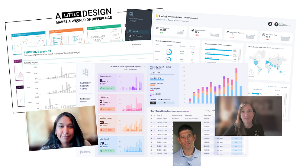
Take, for example, two dashboards I’ve built.

The first dashboard is pretty. Clean, polished—the kind that looks great in a presentation. But it was built from Real World Fake Data as a high-level overview. No clear question. No real intention. It answers everything… and yet, nothing. It answers everything… and yet, nothing. Stakeholders can look at it, click through it, and still walk away unsure of what to do next.

The second dashboard tells a story. It was built to answer a specific question, grounded in real decisions. Every chart exists to help someone understand what changed.
This is where the work becomes less about data, and more about perspective. It’s a moment to pause and put yourself in the stakeholder’s shoes. How will this actually be used? Who is going to interact with it—and how often? What decision is this meant to support? What happens next after someone looks at it?
When those answers aren’t clear, it’s easy to build something that looks complete—but doesn’t actually move anything forward.
I’ve seen dashboards that answer dozens of questions and still leave the stakeholder unsure of what to do next.
And I’ve seen a single, focused view create clarity almost immediately.
The difference isn’t the amount of data.
It’s whether the work was designed with the decision in mind.
That shift—from building what was asked for to solving for what’s needed—has been one of the most important changes in how I approach my work.
It’s also where better questions start to emerge.
The same pattern shows up in how we approach analysis.
It’s easy to ask, “What were sales last month?” And sometimes that’s exactly what’s needed. But more often, the real value comes from going one step further—asking what changed, where it changed, and why.
That shift—from reporting to understanding—doesn’t come from the tool.
It comes from the question.
Over time, I’ve come to believe that the most valuable analysts aren’t the ones who have all the answers right away.
They’re the ones who are willing to slow things down just enough to ask better questions.
They ask things like: Are we solving the right problem? What decision is actually on the line? What would change if we knew the answer?
And sometimes, they’re willing to challenge the question entirely—even when it would be easier not to.
But maybe most importantly, they leave room to be wrong.
That’s something I’ve had to learn over time.
It’s easy to get attached to an answer, especially once you’ve started building toward it. But the moment we become too certain, we stop exploring. And when we stop exploring, we limit the value we can create.
When I think back on the work that’s had the most impact, it’s rarely the work where everything was clear from the start.
More often, it’s the work where something needed to be unpacked. Where the initial question wasn’t quite right. Where a conversation led to a better understanding of what was actually being asked.
In those moments, the biggest shift didn’t come from better data or more advanced tools.
It came from taking the time to understand the problem.
Because behind every request, there’s context.
There’s pressure. There’s a decision someone is trying to make. There’s a gap between what they know and what they need to know.
And if we don’t take the time to understand that, even the most technically perfect analysis can miss the mark.
This is the part of analytics that doesn’t show up in a dashboard.
It happens in conversations. In pauses. In the follow-up questions that feel small in the moment, but end up changing everything.
Great analysts aren’t defined by the tools they use.
They’re defined by how they think, by the questions they’re willing to ask, and by the curiosity to keep going when the first answer isn’t enough.
Lately, I’ve been reminding myself—before I open any tool—to sit with the question just a little longer.
Because more often than not, that’s where the real work begins.

Comments