
How Tableau Informed How I Serve
- Her Data

- May 7
- 8 min read
Yes, I’m biased when it comes to BI tools. But I’d call it an informed bias.
Over the years, I’ve worked across a wide range of business intelligence platforms. Some were fast. Some were flexible. Some were enterprise-friendly. But in my experience, no tool compares to Tableau when it comes to visually presenting a data story.
That perspective didn’t come from marketing or certifications. It came from exposure.
I’ve had the opportunity to work alongside people I consider some of the best in the data industry. Many of them are now peers and friends. I’ve seen what exceptional analytics work looks like up close — not just technically, but from a storytelling, design, and decision-making perspective. So when I say “I know what good looks like,” it’s because I’ve had the privilege of seeing it repeatedly in practice.
As my career evolved into consulting, something important changed: I stopped being the decision-maker on tools.
Clients have their own ecosystems, budgets, security requirements, and engineering preferences. Sometimes that means working in tools I wouldn’t personally choose first. Earlier in my career, I might have seen that as a limitation. Today, I see it differently.
The real skill is not loyalty to a platform. The real skill is carrying principles across platforms.
What Tableau taught me was bigger than Tableau itself.
It taught me:
how to guide attention,
how to reduce cognitive load,
how to create flow in a dashboard,
how to use whitespace intentionally,
how to make metrics feel intuitive,
and most importantly, how to help people see the story in the data.
That mindset now follows me into every tool I touch.
Recently, that has meant spending more time in Python and learning Streamlit.
At first glance, Streamlit and Tableau are solving different problems. Tableau is a mature visual analytics platform built specifically for interactive business intelligence. Streamlit is a lightweight Python framework for rapidly building data applications.
They are not interchangeable.
There are many things Streamlit will not do that Tableau can:
native enterprise dashboard interactions
polished cross-filtering behavior
deep visualization controls
drag-and-drop analytics experiences
and years of UX refinement built specifically for business users
But that’s not the point.
The point is this:
If you understand what makes a great analytical experience, you can bring those principles anywhere.
That realization has been exciting.
What I appreciate about Streamlit is the creative playground it offers. You can prototype quickly. You can combine analytics with machine learning workflows. You can think like both a developer and a designer. And if you approach it with a strong understanding of data storytelling, you can build experiences that feel intentional rather than purely functional.
One thing that makes Streamlit especially approachable is that you can experiment quickly. Their playground environment makes it easy to prototype ideas, test layouts, and iterate on visual experiences without needing a massive engineering setup. If you want to follow along or explore some of these concepts yourself, you can start directly in the Streamlit playground here.
This blog will walk through building a Streamlit app inspired by the design philosophy I learned through Tableau.
Not a Tableau clone. Not “better than Tableau.” And definitely not an attempt to force one tool to become another.
Instead, this is about applying first-class dashboard thinking inside a flexible Python environment.
We know what good looks like.
Now the question becomes:
How far can we push that standard in Streamlit?

Bringing Tableau Thinking into Streamlit
Now let’s look at the actual application.
What excited me while building this was realizing how much of the Tableau mindset transfers into Python when you intentionally design for experience instead of just output.

The code itself is not especially complicated. That’s actually part of the point.
Good dashboards are rarely about technical complexity. They are about intentionality.
Here’s the core framework behind the app:
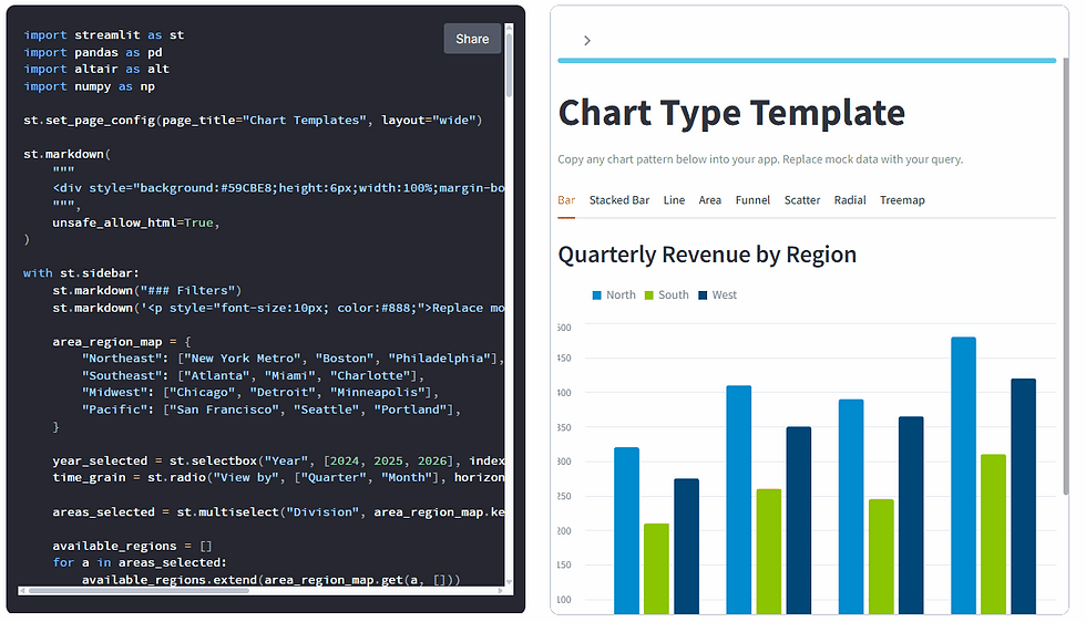
import streamlit as stimport pandas as pdimport altair as altimport numpy as npst.set_page_config(page_title="Chart Templates", layout="wide")st.markdown( """ <div style="background:#59CBE8;height:6px;width:100%;margin-bottom:0.5rem;border-radius:3px;"></div> """, unsafe_allow_html=True,)Even before discussing the charts themselves, there are several design decisions here that came directly from years of working in Tableau.
1. Visual hierarchy matters
The very first thing on the screen is not a chart.
It’s structure.
st.set_page_config(page_title="Chart Templates", layout="wide")followed immediately by:
st.markdown( """ <div style="background:#59CBE8;height:6px;width:100%;margin-bottom:0.5rem;border-radius:3px;"></div> """, unsafe_allow_html=True,)That thin branded header line may seem small, but details like this shape how an application feels.
Tableau dashboards taught me that polish creates trust.
Users notice when an experience feels intentional.
2. Filters should guide, not overwhelm
One thing Tableau does exceptionally well is helping users progressively explore information.
This sidebar follows the same philosophy.
with st.sidebar:The filters are organized logically:
Year
Time Grain
Division
Market
More importantly, they cascade naturally.
available_regions = []for a in areas_selected: available_regions.extend(area_region_map.get(a, []))That interaction pattern feels familiar to modern BI users because it mirrors how people mentally navigate data:
start broad,
then narrow context.
That’s not a Python concept.
That’s analytics UX thinking.
3. Good dashboards reduce cognitive load
One of the biggest mistakes I see in dashboards is trying to show everything at once.
This app avoids that by using tabs intentionally:
tabs = st.tabs([ "Bar", "Stacked Bar", "Line", "Area", "Funnel", "Scatter", "Radial", "Treemap"])Instead of competing visuals fighting for attention on one screen, each chart type gets its own focused analytical space.
That mirrors one of the strongest lessons I learned from Tableau:
Every visual should earn its place.
4. Color is doing real work here
This was one of my favorite parts of the app.
COLORS = [ "#008BCE", "#8BC400", "#004677", "#59CBE8", "#A0D911", "#002B49"]The palette is restrained and consistent across the experience.
A lot of dashboards fail because color becomes decoration instead of communication.
Here, color creates:
continuity
grouping
emphasis
and familiarity
Again, this is something strong Tableau developers tend to understand deeply.
5. Streamlit becomes powerful when paired with design discipline
What surprised me most during this process is how flexible Streamlit becomes once you stop treating it like a rapid prototype tool.
Using:
Streamlit for layout,
Altair for visualization grammar,
and Python for transformation logic,
you can build analytical experiences that feel far more refined than most people expect from a lightweight framework.
The charts themselves reinforce this idea.
The funnel chart uses layered geometry to create a centered conversion experience. The donut chart applies hierarchy and negative space intentionally. The scatter plot balances density with readability. Even the tab structure itself becomes part of the storytelling flow.
None of this happened accidentally.
It came from carrying dashboard design principles into a different technical environment.
Will Streamlit replace Tableau? No.
But that’s not really the point.
The point is that good dashboard thinking travels.
That’s probably the biggest thing Tableau gave me over the years.
Not just proficiency with a platform.
A definition of what good looks like.
Full Streamlit Application Code
Below is the complete application powering the examples above.
import streamlit as st
import pandas as pd
import altair as alt
import numpy as np

st.set_page_config(page_title="Chart Templates", layout="wide")
st.markdown(
    """

    <div style="background:#59CBE8;height:6px;width:100%;margin-bottom:0.5rem;border-radius:3px;"></div>
    """,
    unsafe_allow_html=True,
)
with st.sidebar:
    st.markdown("### Filters")
    st.markdown('<p style="font-size:10px; color:#888;">Replace mock data below with your semantic view query.</p>', unsafe_allow_html=True)
    area_region_map = {
        "Northeast": ["New York Metro", "Boston", "Philadelphia"],
        "Southeast": ["Atlanta", "Miami", "Charlotte"],
        "Midwest": ["Chicago", "Detroit", "Minneapolis"],
        "Pacific": ["San Francisco", "Seattle", "Portland"],
    }

    year_selected = st.selectbox("Year", [2024, 2025, 2026], index=1)
    time_grain = st.radio("View by", ["Quarter", "Month"], horizontal=True)
    areas_selected = st.multiselect("Division", area_region_map.keys(), default=area_region_map.keys())
    available_regions = []
    for a in areas_selected:
        available_regions.extend(area_region_map.get(a, []))

    regions_selected = st.multiselect("Market", sorted(set(available_regions)), default=sorted(set(available_regions)))

display_areas = "All Divisions" if len(areas_selected) == len(area_region_map) else ", ".join(areas_selected)

display_regions = "All Markets" if len(regions_selected) == len(available_regions) else ", ".join(regions_selected)

if not areas_selected or not regions_selected:
    st.warning("Please select at least one Division and Market.")
    st.stop()

st.title("Chart Type Template")
st.caption("Copy any chart pattern below into your app. Replace mock data with your query.")

COLORS = ["#008BCE", "#8BC400", "#004677", "#59CBE8", "#A0D911", "#002B49"]
months = ["Jan", "Feb", "Mar", "Apr", "May", "Jun",
          "Jul", "Aug", "Sep", "Oct", "Nov", "Dec"]

tabs = st.tabs(["Bar", "Stacked Bar", "Line", "Area", "Funnel", "Scatter", "Radial", "Treemap"])
with tabs[0]:
    st.subheader("Quarterly Revenue by Region")
    bar_df = pd.DataFrame({
        "Quarter": ["Q1", "Q2", "Q3", "Q4"] * 3,
        "Region": ["North"] * 4 + ["South"] * 4 + ["West"] * 4,
        "Revenue ($K)": [320, 410, 390, 480,
                         210, 260, 245, 310,
                         275, 350, 365, 420],
    })
    chart = (
        alt.Chart(bar_df)
        .mark_bar(cornerRadiusTopLeft=3, cornerRadiusTopRight=3)
        .encode(

            x=alt.X("Quarter:N", axis=alt.Axis(labelAngle=0)),
            xOffset="Region:N",
            y=alt.Y("Revenue ($K):Q", title="Revenue ($K)"),
            color=alt.Color("Region:N", scale=alt.Scale(range=COLORS[:3]),
                            legend=alt.Legend(orient="top", title=None)),
            tooltip=["Quarter", "Region", "Revenue ($K)"],
        )
        .properties(height=520)
    )
    st.altair_chart(chart, use_container_width=True)
with tabs[1]:
    st.subheader("Support Tickets by Priority")
    priorities = ["Critical", "High", "Medium"]
    stacked_df = pd.DataFrame({
        "Month": months[:6] * 3,
        "Priority": ["Critical"] * 6 + ["High"] * 6 + ["Medium"] * 6,
        "Tickets": [12, 15, 9, 18, 11, 14,
                    45, 52, 48, 55, 42, 50,
                    90, 85, 95, 78, 88, 92],
    })
    chart = (
        alt.Chart(stacked_df)
        .mark_bar(cornerRadiusTopLeft=2, cornerRadiusTopRight=2)
        .encode(
            x=alt.X("Month:N", sort=months[:6], axis=alt.Axis(labelAngle=0)),
            y=alt.Y("Tickets:Q"),
            color=alt.Color("Priority:N",
                            sort=priorities,
                            scale=alt.Scale(domain=priorities, range=["#004677", "#008BCE", "#59CBE8"]),
                            legend=alt.Legend(orient="top", title=None)),
            order=alt.Order("priority_order:Q"),
            tooltip=["Month", "Priority", "Tickets"],
        )
        .transform_calculate(
            priority_order="datum.Priority === 'Critical' ? 0 : datum.Priority === 'High' ? 1 : 2"
        )
        .properties(height=520)
    )
    st.altair_chart(chart, use_container_width=True)

with tabs[2]:
    st.subheader("Monthly Active Users")
    line_df = pd.DataFrame({
        "Month": months * 2,
        "Platform": ["Desktop"] * 12 + ["Mobile"] * 12,
        "Users (K)": [42, 44, 47, 51, 55, 58, 62, 60, 63, 68, 72, 78,
                      18, 21, 25, 30, 34, 38, 43, 46, 50, 55, 61, 68],
    })
    chart = (
        alt.Chart(line_df)
        .mark_line(strokeWidth=2.5, point=alt.OverlayMarkDef(size=40))
        .encode(
            x=alt.X("Month:N", sort=months, axis=alt.Axis(labelAngle=0)),
            y=alt.Y("Users (K):Q", scale=alt.Scale(zero=False)),
            color=alt.Color("Platform:N", scale=alt.Scale(range=["#008BCE", "#8BC400"]),
                            legend=alt.Legend(orient="top", title=None)),
            tooltip=["Month", "Platform", "Users (K)"],
        )
        .properties(height=500)
    )
    st.altair_chart(chart, use_container_width=True)
with tabs[3]:
    st.subheader("Sales Pipeline (Cumulative $K)")
    area_df = pd.DataFrame({
        "Month": months[:6] * 3,
        "Stage": ["Discovery"] * 6 + ["Proposal"] * 6 + ["Negotiation"] * 6,
        "Value ($K)": [120, 180, 260, 310, 350, 400,
                       80, 130, 190, 240, 280, 330,
                       40, 65, 100, 150, 195, 260],
    })
    stages = ["Discovery", "Proposal", "Negotiation"]
    chart = (
        alt.Chart(area_df)
        .mark_area(opacity=0.7, interpolate="monotone")
        .encode(
            x=alt.X("Month:N", sort=months[:6], axis=alt.Axis(labelAngle=0)),
            y=alt.Y("Value ($K):Q", stack="zero"),
            color=alt.Color("Stage:N", sort=stages,
                            scale=alt.Scale(domain=stages, range=["#59CBE8", "#008BCE", "#004677"]),
                            legend=alt.Legend(orient="top", title=None)),
            order=alt.Order("stage_order:Q"),
            tooltip=["Month", "Stage", "Value ($K)"],
        )
        .transform_calculate(
            stage_order="datum.Stage === 'Discovery' ? 0 : datum.Stage === 'Proposal' ? 1 : 2"
        )
        .properties(height=500)
    )
    st.altair_chart(chart, use_container_width=True)

with tabs[4]:
    st.subheader("Lead Conversion Funnel")
    funnel_stages = ["Website Visits", "Sign-Ups", "Activated", "Subscribed", "Renewed"]
    funnel_values = [10000, 4200, 2100, 980, 720]
    funnel_df = pd.DataFrame({"Stage": funnel_stages, "Count": funnel_values})
    funnel_df["Pct"] = (funnel_df["Count"] / funnel_df["Count"].iloc[0] * 100).round(1)
    max_val = funnel_df["Count"].max()
    funnel_df["x_start"] = (max_val - funnel_df["Count"]) / 2
    funnel_df["x_end"] = funnel_df["x_start"] + funnel_df["Count"]
    funnel_df["mid"] = (funnel_df["x_start"] + funnel_df["x_end"]) / 2
    funnel_df["label"] = funnel_df["Count"].apply(lambda v: f"{v:,}") + " (" + funnel_df["Pct"].astype(str) + "%)"
    bars = (
        alt.Chart(funnel_df)
        .mark_bar(cornerRadius=4)
        .encode(
            y=alt.Y("Stage:N", sort=funnel_stages, title=None,
                    axis=alt.Axis(labelFontSize=13, labelFontWeight="bold")),
            x=alt.X("x_end:Q", axis=None),
            x2="x_start:Q",
            color=alt.Color("Pct:Q", scale=alt.Scale(range=["#59CBE8", "#004677"]), legend=None),
            tooltip=["Stage", "Count", "Pct"],
        )
    )
    text = (
        alt.Chart(funnel_df)
        .mark_text(color="white", fontWeight="bold", fontSize=13)
        .encode(
            y=alt.Y("Stage:N", sort=funnel_stages),
            x=alt.X("mid:Q"),
            text="label:N",
        )
    )
    st.altair_chart(
        (bars + text).properties(height=450).configure_view(strokeWidth=0),
        use_container_width=True,
    )

with tabs[5]:
    st.subheader("Campaign Cost vs. Conversions")
    np.random.seed(7)
    n = 45
    channels = np.random.choice(["Paid Search", "Social", "Email"], n)
    cost = np.where(channels == "Paid Search", np.random.uniform(2, 12, n),
           np.where(channels == "Social", np.random.uniform(1, 8, n),
                    np.random.uniform(0.5, 5, n)))
    conversions = cost * np.random.uniform(8, 18, n) + np.random.normal(0, 5, n)
    conversions = np.clip(conversions, 5, None)
    scatter_df = pd.DataFrame({
        "Cost ($K)": cost.round(1),
        "Conversions": conversions.astype(int),
        "Channel": channels,
    })
    chart = (
        alt.Chart(scatter_df)
        .mark_circle(size=80, opacity=0.75)
        .encode(
            x=alt.X("Cost ($K):Q"),
            y=alt.Y("Conversions:Q"),
            color=alt.Color("Channel:N", scale=alt.Scale(range=COLORS[:3]),
                            legend=alt.Legend(orient="top", title=None)),
            tooltip=["Channel", "Cost ($K)", "Conversions"],
        )
        .properties(height=520)
    )
    st.altair_chart(chart, use_container_width=True)

with tabs[6]:
    st.subheader("Revenue by Customer Segment")
    donut_df = pd.DataFrame({
        "Segment": ["Enterprise", "Mid-Market", "SMB", "Self-Serve"],
        "Revenue ($M)": [4.2, 2.8, 1.5, 0.9],
    })
    donut_df["Pct"] = (donut_df["Revenue ($M)"] / donut_df["Revenue ($M)"].sum() * 100).round(1)
    arc = (
        alt.Chart(donut_df)
        .mark_arc(innerRadius=90, outerRadius=160, stroke="#fff", strokeWidth=2)
        .encode(
            theta=alt.Theta("Revenue ($M):Q"),
            color=alt.Color("Segment:N",
                            scale=alt.Scale(range=["#004677", "#008BCE", "#59CBE8", "#8BC400"]),
                            legend=alt.Legend(orient="right", title=None, labelFontSize=12)),
            tooltip=["Segment", "Revenue ($M)", "Pct"],
        )
    )
    center_text = (
        alt.Chart(pd.DataFrame({"text": ["$9.4M"]}))
        .mark_text(fontSize=22, fontWeight="bold", color="#004677")
        .encode(text="text:N")
    )
    st.altair_chart(
        (arc + center_text).properties(height=520),
        use_container_width=True,
    )

with tabs[7]:
    st.subheader("Budget Allocation by Department")
    tree_df = pd.DataFrame({
        "Department": ["Engineering", "Engineering", "Engineering",
                       "Marketing", "Marketing", "Marketing",
                       "Sales", "Sales", "Sales"],
        "Category": ["Infra", "Salaries", "Tools",
                     "Ads", "Events", "Content",
                     "Comp", "Travel", "Enablement"],
        "Budget ($K)": [420, 680, 110,
                        350, 180, 95,
                        520, 140, 75],
    })
    tree_df["label"] = tree_df["Category"] + "  $" + tree_df["Budget ($K)"].astype(str) + "K"
    chart = (
        alt.Chart(tree_df)
        .mark_bar(cornerRadiusEnd=4)
        .encode(
            x=alt.X("Budget ($K):Q", title="Budget ($K)"),
            y=alt.Y("label:N", sort="-x", title=None,
                    axis=alt.Axis(labelFontSize=11)),
            color=alt.Color("Department:N",
                            scale=alt.Scale(range=["#004677", "#008BCE", "#8BC400"]),
                            legend=alt.Legend(orient="top", title=None)),
            tooltip=["Department", "Category", "Budget ($K)"],
        )
        .properties(height=520)
    )
    st.altair_chart(chart, use_container_width=True)
The longer I work in data, the more I believe the best practitioners are not defined by the tools they use, but by the principles they carry with them. Tableau taught me how to think about clarity, flow, hierarchy, and storytelling. Those lessons did not stop being valuable the moment I opened a different platform. If anything, they became more valuable. Whether I’m working in Streamlit, Python, or any future tool that enters the ecosystem, the goal remains the same: create experiences that help people understand data faster and make better decisions. Tools will continue to evolve. Strong analytical thinking travels with you.


Comments